Thursday, August 26, 2010

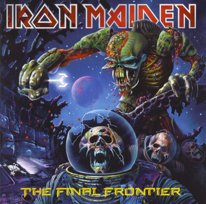
Iron Maiden: The Final Frontier


If you've stopped by this blog more than once before (and thank you for doing so, if you have!), you'll know that I am a huge Iron Maiden fan, and I have been enjoying their music for nearly thirty years now. So it delights me to see that my favorite band is still cranking out the metal tunes even today.

Yes, that's the latest release from Maiden, and I bought it the day it came out, August 17, 2010. Since it's called The Final Frontier, I suppose this might be the last studio album the band puts out before they all retire for good. So, I'd better enjoy the hell out of it, right? No worries.

Let's start with the cover art. Here, Eddie has apparently been genetically combined with an alien species, and he's suffered some kind of damage because his cranium has been opened to space. (It doesn't seem to bother him, though.) He holds a key of some kind, and he looks over the freeze-dried carcasses of another type of alien in their ruined space vessel. Striking visuals, and very colorful in contrast to the bleakness of Maiden's previous album.

The songs: Stylistically, they cover a lot of ground. There's much that sounds like old, familiar, comfy Iron Maiden, and then there's some that goes off in different directions, even challenging the expectations of long-time fans like me. For example, "Satellite 15 ... The Final Frontier" (which is really two songs in one) sounds like nothing I've heard before, and it's a very interesting way to start the album off.

Thematically, the songs are all over the place. They deal with space travel and exploration ("Satellite 15 ... The Final Frontier" and "Coming Home"), war and religion ("Mother of Mercy" and "Starblind"), legends ("Isle of Avalon" and "The Man Who Would Be King"), old-time sea-faring adventures ("The Talisman"), fear ("When the Wild Wind Blows"), historical mysticism ("The Alchemist"), and even scam artists ("El Dorado").

And you know what? There's a lot here to like. Steve Harris and crew may be getting old, but they aren't slowing down. And they certainly haven't lost any of their creativity. It's a good listen, from start to finish, and I have the feeling I'm just at the beginning of my enjoyment of this album.

Monday, August 23, 2010

State quarter designer -- in Texas

Hey, guess what I found out? One of the designers of the state quarters lives just up the road from San Antonio in New Braunfels!
NEW BRAUNFELS — You may not know who artist Susan Gamble is, but chances are you have one of her drawings.

And you're carrying it in your pocket.

Gamble, who lives in New Braunfels, is one of five master designers in the country whose renderings are used as artwork on coins for the U.S. Mint.

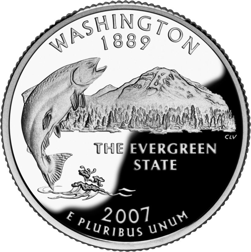
She drew the leaping salmon in front of Mount Rainier for the Washington state quarter, the grizzly bear catching a salmon for the Alaska state quarter and the scissor-tailed flycatcher soaring over Indian blanket wildflowers for the Oklahoma state quarter.

(from the Express-News)

That's right. These are her designs:


And here are the reviews I gave them:

Washington - 2 - Mediocre
Oklahoma - 2 - Mediocre
Alaska - 2 - Mediocre

I know these are just my personal opinions, but I hope Ms. Gamble stumbles across this blog sometime and takes a moment to read my reviews. Yes, they are just the views of a regular guy who carries these coins around every day, but they might prove useful to her in any future artwork she develops. Or maybe not.

Of course, what really boggles my mind is that Ms. Gamble -- and only a few other artists -- are the ones who got to determine what went on all fifty of the state quarters. I really and truly thought the states themselves had some say in these designs, but apparently not!

And why not?

Why would the U.S. Mint rely on just a few people to design all these coins that are supposed to be representative of the states they, well, represent? Convenience? Probably so, but I wonder now if any of the states' residents actually got a chance to voice their opinions on the state quarters. If not, I'm a bit disappointed in the whole program.

P.S.: Whoever designed the Texas quarter, you did good, though, even if you didn't check with any Texans first! I gave it a 5 - Best!

Using the wrong metaphor

At St. Philip's College in San Antonio, economic shortfalls have forced the school to insist on larger class sizes in order to consolidate resources. As such, some of the smaller classes have been canceled. Students, who are often working-class and looking for a trade education, are understandably upset, as KSAT-12 reports:
Michelle Monsees, a welding student, said the consolidation of classes could affect her ability to take care of her kids.

"How am I supposed to take a class at night when I have kids to be watching?" she asked.

Another student pointed to his class schedule, "Here's four classes I needed to finish out the semester (of) which two ... are going to be canceled," said Nick Ramon.
They have a right to be frustrated, but what caught my eye in this story is the response of St. Philip's Vice President of Academic Affairs Ruth Dalrymple. She said, in considering options,
"We have a number of students who are trying to jumble working and family and classes and we'll take a look at that as well," she said.
It's hard enough to juggle work, family, and school, but I suppose it's also possible some of the students are going one step further in the difficulty department and are consciously trying to mix all these things together into confused messes.

But I could be wrong.

Sunday, August 22, 2010

Quote of the day

"The jet, as well as being an ambassador of death for the enemies of humanity, has a main message of peace and friendship."

Though I kind of
like the idea of an "ambassador of death" for all those pesky alien invaders, somehow I don't think that's what Mahmoud Ahmadinejad meant by this. And I'd be interested to know what kind of friendship this device brings.


Tuesday, August 17, 2010

What I bought today


Oh, yes. Happy me! New Maiden, just released.

Give me a couple of weeks or so. I'll have a review ready. But I need to soak it in first.

Saturday, August 14, 2010

Showing off stabby things

The Pistolero is showing off his cool knife. It's nice.

Here's mine.


It's a Buck, a brand I've always been partial to. But I don't use this particular knife very much.

Why not? you say. Well, take a closer look.


Yep, that's George Strait's mug on that blade. A special edition knife, this is. So, since it's very nice, and I don't want to subject poor George's face to any mundane nastiness, I just can't bring myself to use it like a regular blade. As such, it usually just sits inside its special sheath.


Do you have any special knives that you can't bring yourself to use?

Friday, August 13, 2010

Review: Territory quarters

I promised I would get to them, so here they are, the United States Territories quarters. Since there are only six of them, I will cover them all in one post.

Let's begin with:


The District of Columbia


OK, D.C. is unique. It's not a territory. But it's included in this quarter series by the U.S. Mint, so there it is.

And it's not very good. To begin with, I like the concept of doing something completely different with the design (I was expecting the Washington Monument, to tell you the truth), so I was pleasantly surprised to see jazz great Duke Ellington featured all on his own. But the problem here is that this is a quarter, not a full-sized portrait. So that image of Ellington is nothing more than an amorphous human outline. It might as well be anybody, because it sure as hell doesn't look like any jazz great I know.

Overall rating - 2 - Mediocre


Puerto Rico


Puerto Rico produced a good design. The garita is a nice element to feature because it is pleasing to the eye, and it's different from what you might expect to see on a quarter design. (It reminds me of the Miradores del Mar along the seawall in Corpus Christi.) The only thing I don't like about this design is the inclusion of the flowers, but I think I can let that one slide.

Overall rating - 3 - Good


Guam


The designers of the Guam quarter also did very well. There's the outline of the territory -- a technique employed quite often in the State Quarters program -- accented by two simple, iconic elements: a sailing boat and a structure known as a latte stone. These pillars are said to be foundations for huts, or even houses, but they are obviously important symbols of the native people that live on the islands in the area. It's a unique structure, and it looks good on this coin. (I'm ignoring the text; it's small enough to be inconspicuous.)

Overall rating - 3 - Good


American Somoa


Ah, yes, American Somoa. Land of virile people like Junior Seau and The Rock. And a place that knows how to use its cultural elements. There you have the the kava bowl, the fly switch, and the staff of authority, all arranged nicely on that small round canvas. They could have left off the motto and the tropical landscape in the background and it would have been better, but a good effort nonetheless.

Overall rating - 3 - Good


U.S. Virgin Islands


The U.S. Virgin Islands! What's great about them? Tim Duncan, that's what!

But not this quarter. It's a mess of trees, flowers, a lonely bird -- all of which almost never work out on these designs -- and a frowny-faced outline above a lame motto. Not good at all.

Overall rating - 1 - Bad


Northern Mariana Islands


Here we have the quarter design for the Northern Mariana Islands, and here we have a repeat of what we've seen before on the Guam quarter. There's that sailing boat again, and there's another latte stone, so right away it's not original. And there's additional clutter in the form of birds, trees, beach sand, and some kind of foliage in the foreground. It's not completely terrible, but it doesn't quite make it to "good" either.

Overall rating - 2 - Mediocre


Well, that wraps up the Territories Quarter Program. But the fun ain't over yet!

Stay tuned for updates on the "America the Beautiful Quarters" series, which is ongoing! This series celebrates the U.S. National Parks, and there will be 50 of them as well, one for each state (Texas will feature the missions in San Antonio - yay!).

They've only released the first three quarters in this series, and two more designs have been revealed, so maybe there's still time to get to some of these committees and convince them to be very careful in their work. Know anybody on one of these committees? Direct them to this blog, and then have them peruse my coin reviews before settling on a design. They'll get some food for thought, you'll only be doing your state a favor.

Wednesday, August 11, 2010

What I bought today


I splurged a little and got myself this gem on CD. I was glad to get it because I've been frustrated lately. Old Black Sabbath music is hard to come by. And Ozzy Osbourne has a real quirkiness when it comes to any music he seems to have had an influence on.

For example, Ozzy went totally George Lucas on all his fans and re-recorded his first two incredibly influential (and nearly perfect on their own) solo albums, Blizzard of Ozz and Diary of a Madman, ending up with less-enjoyable versions after the effort. No kidding, the drum and bass tracks from the original albums were removed and replaced with recordings by other artists, and these re-releases are the only versions available if you try to buy them new. So, unless you actually own vinyl or CD versions of these albums from the 1980s or 90s, the only thing you can get these days are much weaker imitations. Even Bark at the Moon (which was only remixed, not re-recorded) sounds a lot crappier than it did when it first came out. I bought that one through iTunes, and I was sorely disappointed with what was downloaded to my computer.

And then, there's the Black Sabbath music. Ozzy seems to think only he owns anything that has to do with Black Sabbath before he left the band, and he recently fought a legal battle with Tony Iommi (the guitarist and the only member of the band to actually be in the band for its entire existence) for actual ownership of the name "Black Sabbath". Supposedly their feud is over, but, for some reason, Ozzy has been refusing on-line access to any Black Sabbath album or song recorded with him. Go to iTunes or Amazon, and you can find anything Ozzy has recorded solo, and you can find Black Sabbath material produced after Ozzy left the band, but absolutely nothing is available from the time before he jumped ship. No Paranoid. No Master of Reality. No Technical Ecstasy. No nothing.

And guess what? I've been itching to hear some old Black Sabbath, especially some things that I haven't heard in decades.

Then, today, I came across Sabotage. It has been so long since I have heard the tasty tunes on this album that I have almost forgotten what they sound like. "Hole in the Sky". "Symptom of the Universe". "The Writ". These are some of the songs that shaped my appreciation for metal and set the stage for future pursuits in the genre. This album and Sabbath Bloody Sabbath were a couple of my closest companions in my formative years, and it has been to my sadness that I have not had a copy of Sabotage since high school, thanks in part to its limited availability in music stores and its complete absence online.

But now I have found it. And now I have it! Good times for me!

Oh, and I always thought the cover art was pretty cool for this album. It shows the band members looking great in duds that demonstrate the height of 1970s hard rock/metal fashion.

Well, except for Bill Ward. He insisted on wearing his red tights for the photo shoot. With checkered underwear.


I suppose there's no accounting for taste, even in the 70s.
.

Monday, August 09, 2010

Overusing "green"

.
It's official. The concept of "green" now means absolutely nothing. Or it means everything, depending on your view.
.

Saturday, August 07, 2010

Rear entrance morning


Cafe's around back. Knock three times, then twice. That way they'll know you're not the health inspector.
.

Thursday, August 05, 2010

Correcting my mistake

.
Well, it's a bit embarrassing, but I have to take a moment here to correct a mistake I made on this blog.

Some time ago I put up a post about a new piece of music I had discovered. That post (now corrected) is here. I heard the piece playing on KPAC one day, and, as I usually do when I hear something that I like and have never heard before, I waited until the end to hear the name of the piece and the composer so I could download the work later. I heard the DJ say it the Danzón No. 2 by Keri-Lynn Wilson, someone who I had never heard of before. To tell you the truth, I was a little excited to have learned of a newer piece of classical music that sounded so good!

Back in the 20th Century (way back then!), many composers took music in new directions by experimenting with atonality and alleatory music and 12-tone rows and other methods that look good in theory but that ultimately result in music that is difficult to listen to. But, beginning in recent decades and continuing today, contemporary composers seem to be returning to a mindset that music should sound good, too. There's nothing wrong with experimentation, and there are still composers that work with minimalism and atonality, but ultimately music should be a pleasure to listen to, not a chore. And I'm happy that many of today's composers seem to realize this. (Michael Torke is one of my favorites.)

So, I thought, Hey! Here's a new composer I've never heard of, but that piece is pretty cool. I'll look her up and find out a little more.

And I did. And in short order I found an album of her works, and it contained a recording of the Danzón No. 2 that I had taken such a shine to. I downloaded the piece, and I have been enjoying it immensely.

And then the other day, while driving home from work, I turned on the radio. And, happily, the Danzón No. 2 was playing. But it was a different recording of the piece with slightly different dynamics. I turned up the volume, and I enjoyed listening to how this recording varied from the one I was used to.

Then came the surprise.

At the end of the piece, the DJ announced that we had just heard the Danzón No. 2 from ---- Arturo Márquez!

What?!

As soon as I got home I logged on and did some frantic research, and this is what I found out:

1. Keri-Lynn Wilson is a Canadian conductor and flautist, not a composer (that I can tell).
2. The album I had looked at and downloaded the song from was not a compilation of Wilson's works but of pieces she had conducted. That's what the first DJ had been talking about.
3. I had spelled her name wrong initially.
4. Arturo Márquez is a contemporary Mexican composer, and he is the person who actually wrote the Danzón No. 2.
5. I need to listen to what the DJs say more carefully.

Sorry about any misunderstanding I may have caused by my previous post. I have since corrected it and linked to this explanation in case someone comes across it in the future. I will strive to do better.
.

Friday, July 30, 2010

My period instrument is bigger than yours ...

.
...but don't let it get you down.


[Possibly unintentional humor resulting from unfortunate photo placement on an otherwise fabulously cool YouTube channel]
.

Thursday, July 29, 2010

Photographing the dead

.
I don't have a particular fascination with death, nor do I have a strong aversion. I considerate it to be part of our existence, and the way we mourn the passing of a loved one can be as important to our mental health as how we celebrate happy events.

That having been said, I was a bit surprised to discover this practice, the art of photographing the dead with the family, on a favorite site of mine, There, I Fixed It. The pictures at that post are both touching and mildly disturbing. Like this one:


Here's an excerpt:
Many of the subjects of the photos were young children, which reflects a definite change in regards to the decrease in the infant mortality rate in developed nations. Being the great equalizer that death is, people of all ages were memorialized this way. The bodies were preserved following certain procedures that are still practiced today with regards towards physical preservation (embalming with arsenic salts, alcohol, and formaldehyde) and dressed in their finest clothes.

Keep in mind that photography in the 19th century was an elaborate process; both time consuming and certainly expensive. For many people this was the only photo that would be taken of them.
I'm glad I learned of this old art. I don't particularly revel in such morbid topics, but I'm not shy, and this practice is moving in a way.
.

Tuesday, July 27, 2010

Things that make you go "Why?"

.
OK. I like Star Trek. It's very entertaining. (Except for Nemesis!)

But, please----c'mon guys!
Australia's Jenolan Caves will soon offer the world's first audio tour voiced entirely in Klingon, the guttural language created for the popular "Star Trek" aliens with bumpy foreheads and a warrior's mentality.

On Aug. 22, the Klingon language will be one of three options added to the eight currently available for the self-guided audio tour through the "Nettle Cave." As many as 200,000 people pass through the chambers of this underground labyrinth annually, making it the most visited cave on the continent, Jenolan Caves Reserve Trust officials said in a statement.

"We are poised to boldly go where no other tourist attraction has gone before, with the first cave tour in the world to be available in the Klingon language," Reserve Trust officials said.
(from Space.com)

OK, this, and exactly this, is why people who are not Star Trek fans sometimes think that all Star Trek fans are such freaks. I like to have fun and all, but really, out of all the blessed languages on the Earth that actually are spoken by humans and carry meaning outside of a fictional space show someone actually chose to use whatever influence they had to convince someone else in an official position to accept Klingon as a legitimate language option on tours of the most-visited cave on the continent?!!

Geez! Elvish would have been a cooler choice.

But not by much.
.

Sunday, July 11, 2010

Getting busy

I've got a lot of stuff happening these days. Blogging may be light for awhile.

Saturday, July 10, 2010

Review: State quarters - Hawaii


Last but not least -- here's Hawaii.

I really kind of like this design. That representation of King Kamehameha looks downright stately, and I'm not even bothered by the state motto. The outline of the island chain could have been left off because at the scale of U.S. coinage it just looks like so many misplaced dots, but it doesn't detract from the overall look very much.

Nicely done, Hawaii.


Overall rating - 3 - Good.


Well, that's it. I've done all fifty state quarters. I know there are territory quarters out there, and the U.S. has even started a series of quarters featuring national parks, but I think I will take a little break from reviewing for now. There are only six territory quarters, so that shouldn't take me long to do, when I get around to it. And the park quarters have just started and will continue through 2021. I have time to get to those.

But let's hope someone designing those park quarters will run across my state quarter reviews and take some suggestions to heart; there are only so many mushy mountain and tree scenes on our coins that we can stand.

Wednesday, July 07, 2010

Review: State quarters - Alaska


Alaska's quarter design is almost exactly like Washington's design, which isn't a good thing. It could have been a lot better but for the following:

-- The bear is not quite prominent enough. It should have been bigger, with no fish in its mouth.
-- The background earthwork and trees are a mess. They detract from rather than add to the design.
-- The state nickname is uninspiring. It's little more than filler.
-- The splashes of water are barely recognizable as splashes of water. They look more like foliage.

I'm disappointed.


Overall ranking - 2 - Mediocre

Last up: Hawaii.


ADDED: I've recently discovered that the reason this design resembles Washington's so much is that they were developed by the same artist!

Monday, July 05, 2010

Making new music

Traditional musical instruments not challenging enough for you? You could always make up your own.

Introducing, the bassoforte.


(hat tip: There, I Fixed It)

Review: State quarters - Arizona


C'mon, Arizona. I heard you really were a gas. But this quarter is screwed up; it's a total mess.

Did you really think you could take the huge grandeur of the Grand freakin' Canyon and fit it all onto a little bitty twenty-five cent piece? Did you?


Anyway, there's nothing left to do except mock your lame attempt by throwing on a bit more messiness.


BTW: This quarter also had sun rays.


Overall rating - 1 - Bad

Next: North to Alaska

Saturday, July 03, 2010

Independence Day


I hope your holiday is festive and safe.
.

Friday, July 02, 2010

Satanists -- you need a better symbol

.
Yes. Thank you, Cracked.com. I am a Catholic, and for many years I have been trying to tell any Satanists I encounter that they have been spinning their wheels with the whole upside-down-cross thing. They need a better symbol for themselves, but they just don't seem to understand that when I mention it to them.

Maybe they will listen to you.

One of the most popular Satanist symbols is the upside down cross, the reasoning behind which seems obvious enough. With the possible exception of that pentagram thing with the goat's head inside it, the inverted cross is the most immediately recognizable symbol of defiance against Christianity. It's certainly the easiest to tattoo onto your own face.

That's pretty hardcore. But there's only one man on Earth who is death metal enough to have an inverted cross carved into his own throne.

Whoa, wait a second...

If those Satanists had paid attention in Sunday school, they would probably realize that the inverted cross is actually the personal trademark of Saint Peter, the first Pope, and one of the most revered figures in Catholic lore. When Peter was martyred by crucifixion he was said to have requested to be crucified upside down because he didn't feel worthy of dying the same way as Jesus. As a result, many dyed-in-the-wool Catholics actually consider the inverted cross to be a more acceptable thing to attach to your tacky jewelry than a regular right-way-up one.

Also not-really-evil: the pentagram. At least that's what Sir Gawain thought. To him, the five-pointed star was downright holy.

C'mon, Satan worshippers. Come up with your own symbol. The goat head thing is a good start, but you're going to have to work hard to separate it from the whole tradition of cabrito. At least here in South Texas.


Tuesday, June 29, 2010

Review: State quarters - New Mexico


Good job, New Mexico. You took your simple state outline (those little jags in the lower left save it from being a simple rectangle) and you superimposed upon it that cool-looking sun symbol. You could have left off the state nickname, because it's kind of lame, but overall this is a very nice design. Simple, yet bold and iconic.

I like it.


Overall rating - 3 - Good

Arizona really was a gas. And it's next.

Thursday, June 24, 2010

Review: State quarters - Oklahoma


[Full disclosure: I am a Texan. This review may be biased.]

Just kidding, Oklahoma! I love ya! You're a great state, with your prairies and tornadoes and Sooners and Broadway-musical-inspiring ways and proximity to Texas! It's just ----- it's just ---- well, you put that bird on your quarter. A scissortail flycatcher, accented by pretty flowers.

Do I really need to make the point again?

I thought not.


Overall rating - 2 - Mediocre

Next: New Mexico

Sunday, June 20, 2010

The Carlo Martello


Where do you suppose it's going?

Did you know it has its own press release online?

On 27th June 2009 the 8,000KW tug vessel named "Carlo Martello" has been delivered to Augustea Imprese Marittime e di Salvataggi Spa, by the shipyard Rosetti Marino, Ravenna, Italy.

The vessel is the twin of the tug Carlo Magno, so far the flagship of the deep-sea tug fleet. The vessel has the innovative "UT 514 L", developed specifically by Rolls Royce to meet the precise requirements of the company, it runs on heavy fuel oil, a solution that turned out to be particularly competitive in the case of the Carlo Magno.

The Carlo Martello has a power of 12,000 BHP, a bollard pull of around 150 tons and a speed of over 15 knots. The vessel is equipped with R.I.N.A. Fire Fighting 1, with an autoprotection system which can be used for salvage services.

Get to work, buddy.

Saturday, June 19, 2010

Review: State quarters - Utah


When I first saw this quarter, it took me a while to figure out what was going on. I saw the trains and realized the importance of the railroad to the American West. I saw the mountains and thought, OK, Utah has mountains. And then I was trying to figure out what city in Utah has that tower as part of its skyline. I thought of Salt Lake City, but I couldn't remember anything about a significant tower in that city, especially not one set against the backdrop of a mountain range. Then I thought of ---- OK, well, the only city I could think of was Salt Lake City. But still, what is with that tower? Why is that giant spire rising from the mountains of Utah to cast its shadow on those two trains moving to greet each other and -------

Wait. What? That's the Golden Spike? Really? That's supposed to be the ceremonial spike that joined the first Transcontinental Railroad in the United States?

Well, they could've made it look more like a spike and less like the Tower of the Americas.


Overall rating - 2 - Mediocre

Oklahoma's OK to be next.

Wednesday, June 16, 2010

Review: State quarters - Wyoming


Here is an example of something great that is made lesser by something ungreat.

If Wyoming had just stuck with the silhouette of the bucking bronco, this would have been one of the best designs, hands down. That silhouette speaks to the American Wild West more than anything else, and it is an image that is widely recognized and generally accepted as a key component the cowboy culture and history.

So, what could reduce the greatness of this symbol of roughness and wildness and true grit and determination?

The state nickname: The Equality State

*yawn*

Or, more precisely, *whothehellpickedthattobethestatenickname!??!?1!!* and *whothoughtthatwouldlookgreatonourquarter?!!?1?!!!*


Overall rating - 3 - Good

Utah's next.

Friday, June 11, 2010

Review: State quarters - Idaho


Remember what I said? Unless your state bird is an eagle, a hawk, or a falcon, it has no business being on your state quarter design?

Idaho got the message.

The only thing I would do different would be the elimination of the state motto. Other than that, this is a fine design.


Overall rating - 4 - Better

Waiting for Wyoming.

Thursday, June 10, 2010

One of the reasons I like my native language so much

.
Here is a brief exchange about what form a certain English word should take. These are serious considerations, and they can be found in the comments section of this Language Log post.

  1. wally said,

    June 10, 2010 @ 11:31 am

    Since this is Language Log, I thought we might explore the correct form of the verb in this phrase from the Onion article.

    "until the oil company had bullshit its way"

    Bullshit doesn't sound quite right to me. Bullshitted? Bullshat? I don't know.

  2. Mr Fnortner said,

    June 10, 2010 @ 11:41 am

    The verb should take its cue from the base "shit" which has shit or shat as its past participle, I would imagine. I believe the form printed is correct.

  3. Dan T. said,

    June 10, 2010 @ 12:08 pm

    But "bullshitted" is, as Steven Pinker would say, a "headless" verb, being derived from the noun "bullshit" rather than the verb "to shit". Hence, it should get a regular preterite suffix.


A regular preterite suffix, indeed. English is so fun sometimes, even when you are serious.
.

Tuesday, June 08, 2010

Review: State quarters - Washington


Mm. I'm disappointed. Washington could have had such a cool design for their quarter if they had kept the fish, enlarged it a bit, put it in the center, and then dumped everything else. The landscape of mountains and trees is a mess, the state nickname is just filler, and the little splashes are cartoonish and annoying.

I made the comment on the Oregon quarter review that I thought they had done a strangely good job of depicting Crater Lake and that I couldn't quite put my finger on why I liked it. Then Alan, a fellow local blogger, made a particularly keen observation that I couldn't argue with:
I think this one works because so much of it is nothing. The trees and mountains show where the water is, but the water itself is just flat nothingness. Imagine how terrible it could be if they'd tried to stamp tiny "wavelets" all over it to show where the water is.

How terrible, indeed.


Overall rating - 2 - Mediocre.

Idaho's in the pipe.

Friday, June 04, 2010

Reaching for orbit

.
Things like this make me happy.
CAPE CANAVERAL, Fla. – A multimillionaire's test rocket blasted off on its maiden voyage Friday and successfully reached orbit in a dry run for NASA's push to go commercial.

SpaceX's Falcon 9 rocket achieved Earth orbit nine minutes into the flight as planned, drawing praise from NASA, the White House and others eager for the company to start resupplying the International Space Station.

"This has really been a fantastic day," said an exuberant Elon Musk, SpaceX's founder. He said Friday's launch helps vindicate President Barack Obama's plan to give private companies the job of ferrying cargo and ultimately people to the space station, freeing up NASA to aim for true outer space.

I'm not a big fan of Obama (and somehow I don't think he really thought through his approach to the space program), but I'm willing to give him credit where it is due. If his edicts produce a truly viable commercial approach to space, then more power to him and to us all.
.

Tuesday, June 01, 2010

Review: State quarters - Montana


Great job, designers of the Montana quarter. You did good. You may not have a lot of people in your big state, but you've got a good eye for the symbolism. That big skull is perfect. I like it so much, I'm forgiving your inclusion of that gloopy mess below it.


Overall rating - 5 - Best

Waiting for Washington.

Sunday, May 30, 2010

Remember


Memorial Day
Fort Sam Houston

Review: State quarters - South Dakota


So close, South Dakota. You almost got a "Better" rating. I like the idea of using Mount Rushmore on the quarter design because the monument is very patriotic, and it is easily recognizable the world over. It's a natural, and I think it works even on a coin-sized canvas.

But, then there's the bird, which kept this design from getting a higher rating. Again, unless your state's official bird is an eagle, a hawk, or a falcon, it has no business trying to look cool on a quarter. Or anywhere else.


Overall rating - 3 - Good.

Montana's on deck.

Saturday, May 29, 2010

Advancing humanity

.
What happens when a deaf baby is given the gift of hearing for the first time?

This:


Makes me smile, too.

(Hat tip: Instapundit)
.

Friday, May 28, 2010

Review: State quarters - North Dakota


Not bad with the bisons, North Dakota. They are grand and indicative of the great American plains, and two is not too many here. Your design even calls to mind another classic coin. Too bad Kansas beat you to it with a slightly better look.

Oh, and nice use of the rays (seen previously here, here, and here).


Overall rating - 3 - Good

Next, down just a bit for South Dakota.

Thursday, May 27, 2010

Answer: Where this place is

.
To answer the previous post about where this place is:


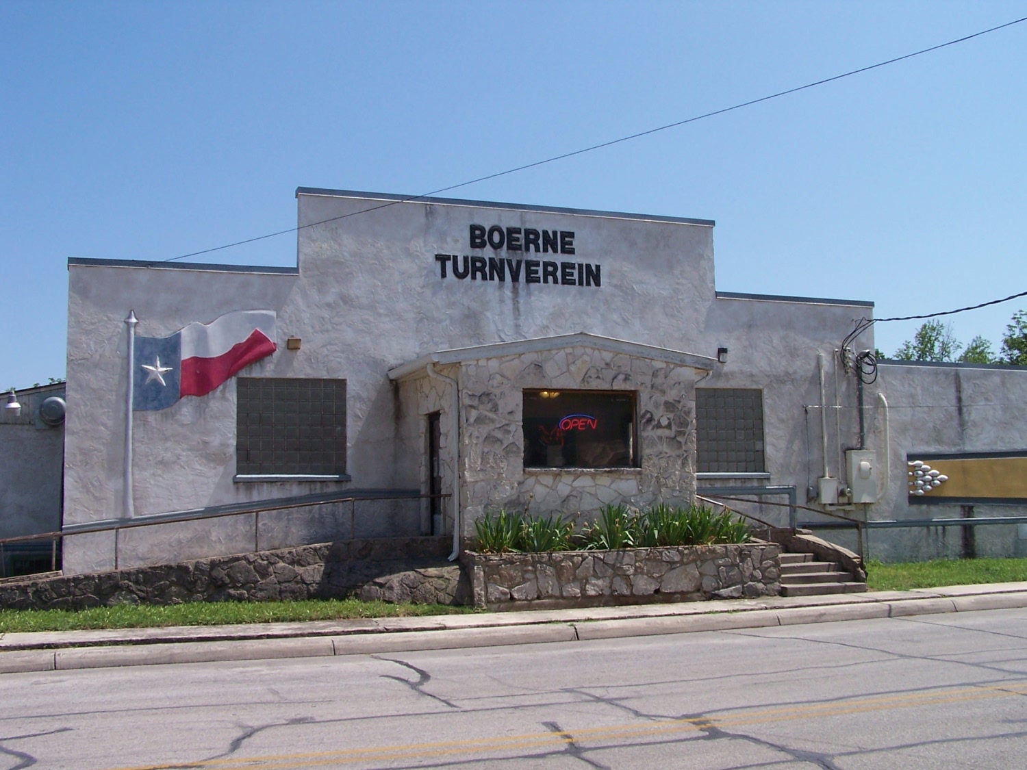
The place is Boerne.


And the picture was taken in front of the historic Turnverein.

Happy bowling.
.

Tuesday, May 25, 2010

Question: Where is this place?


If you think you know where in the San Antonio area this place is, share your answer in the comments section. Bonus blog points for guessing the name.
.

Monday, May 24, 2010

Possibly the best music video ever made

.
And remember, when you start to take yourself -- and your life -- a bit too seriously, keep this in mind:


Even Spock can laugh at himself.


.

Review: State quarters - Colorado


Poor Colorado. It's a rectangle. That's so unexciting.

But it's got awesome mountains! And breathtaking views! And sublime nature! And, and, and, that's what we need to put on our little, tiny quarter. Big, huge Rocky Mountain highs!

And thus is born the most epic of nature fails, Colorado's clumpy quarter design.


Overall rating - 1 - Bad

Next up: North Dakota

Saturday, May 22, 2010

Thursday, May 20, 2010

Review: State quarter - Nebraska


I kind of like Nebraska's quarter. The tall, jagged austerity of Chimney Rock provides a good balance to the smooth roundness of the sun (which, of course, is sending forth those nice life-giving rays). It actually makes for an effective landscape on such a small canvas.

And then, they had to put that wagon on there. In this picture, you can at least tell what it is. On a quarter, it's a blob. And it kept this rating from being one notch higher than "Good".


Overall rating - 3 - Good

Colorado's coming.

Tuesday, May 18, 2010

Review: State quarters - Nevada


Nevada's quarter is too cluttered. Three wild horses when one would have done fabulously. A mushy set of mountains. The lame use of state flowers (which this one is also, apparently, quite dangerous for those poor horsies). The only thing that looks cool is the use of the sun rays, which is the second time we've seen such usage. But that by itself isn't enough to redeem this jumbled design.


Overall rating - 2 - Mediocre

Need I say Nebraska?

Sunday, May 16, 2010

R.I.P. Dio

.
Heavy metal loses part of its voice.

Ronnie James Dio, whose soaring vocals, poetic lyrics and mythic tales of a never-ending struggle between good and evil broke new ground in heavy metal, died Sunday, according to a statement from his wife and manager. He was 67.

Dio revealed last summer that he was suffering from stomach cancer shortly after wrapping up a tour in Atlantic City, N.J. with the latest incarnation of Black Sabbath, under the name Heaven And Hell.

I liked Dio, especially his solo stuff. I remember buying Holy Diver when it first came out, and I was pleasantly surprised that "that guy from Black Sabbath and Rainbow" had put together such a good metal album. Some of it was obviously geared for radio play, but it's still a hard-rocking album that carries all the characteristics of Dio.

He will be missed by the metal world.
.

Friday, May 14, 2010

Beach afternoon


What is there to do at the beach? Well, you can fish, you can wade, you can swim, you can walk around ---- just don't spend too much time sitting in one place.
.

Thursday, May 13, 2010

Looking for a Sun-Earth climate connection

But wait, I thought the science was settled. Humanity is to blame for "climate change", right? Not the sun.
The surface of the sun undergoes violent changes on a daily basis, but a group of astronomers has found that the size of our nearest star has been perplexingly constant in recent years.

The new study shows that the sun's diameter has changed by less than one part in a million over the last 12 years. The sun's width today is a steady 932,057 miles (1,500,000 km) across, the researchers found.

"The sun is remarkably constant," lead researcher Jeff Kuhn, the associate director of the University of Hawaii Institute for Astronomy, told SPACE.com. "We're measuring that the diameter changes by less than a kilometer (0.62 miles).

"This constancy is baffling, given the violence of the changes we see every day on the sun's surface and the fluctuations that take place over an 11-year solar cycle," Kuhn said.

The puzzling results also contradicted other measurements of the sun taken from the ground, raising further questions on what could be causing the discrepancies.

"What this really means is that, if we believe the ground measurements, then what we're seeing is long-term fluctuations in the Earth's atmosphere," Kuhn said. "The sun is influencing the atmosphere of the Earth in very significant ways."

Kuhn's work is one of several worldwide efforts to understand the influence of the sun on Earth's climate.

"We can't predict the climate on Earth until we understand these changes on the sun," Kuhn said. [emphases added]

(from Space.com)

Bold words, Mr. Kuhn. Bold words.
.

Wednesday, May 12, 2010

Review: State quarters - West Virginia


Ho-hum.

I'm sure the New River Gorge Bridge is an awesome sight to see in person, but on the back of a quarter? Not so much, West Virginia.


Overall rating - 2 - Mediocre

Back out west for Nevada.

Monday, May 10, 2010

Review: State quarters - Kansas


Kansas gets kudos for this one. The flower in the lower left was unnecessary, but the state did right by choosing one main iconic element for this quarter design -- a big, bold bison. Nothing says America on the open plains more than this shaggy beast.


Overall rating - 4 - Better

Due east for West Virginia

Friday, May 07, 2010

Review: State quarters - Oregon


Damn.

Just after I get finished making note of how nature scenes seem to fail on the state quarters, Oregon has to come along and prove me wrong with this, the representation of Crater Lake on their quarter. It's not perfect, but it's a good depiction of one of the coolest natural water formations in the United States.

I have to admit, I like it. I don't know exactly why it works for me, but it does.


Overall rating - 3 - Good

Stay tuned for Kansas.

Thursday, May 06, 2010

Contemplating life on Titan, right here on Earth

.
I've heard about tar pits before, but did you know there is a lake of tar in Trinidad that is larger than Vatican City?

And did you know it could help us understand how life could develop on Titan?
A lake of asphalt may be the closest thing on Earth to the hydrocarbon seas on Saturn's moon Titan, and it is apparently teeming with microbial life.

Not only could these findings help in the search for aliens in our own solar system, but they could provide insight into the evolution of life on this planet.

The largest naturally occurring asphalt lake on Earth is Pitch Lake on the Caribbean island of Trinidad, where black goo oozes across roughly 114 acres, an area slightly larger than that covered by Vatican City. Brimming as it is with hot asphalt and bubbling with carbon dioxide and hydrocarbon gases, Pitch Lake hardly seems fit for life.

However, scientists now find each gram of sticky black goo in Pitch Lake can harbor up to 10 million microbes, including bacteria as well as other single-celled organisms known as archaea.
(from Space.com)

This planet is teeming with life, even in the most inhospitable places, which means it shouldn't be all that surprising if we get to another planet or moon and happen to find something living. Especially at a microbial level. But, coming from someone who thinks we need to start ramping up our space exploration -- and colonization -- efforts, part of me hopes that never happens.
.

Tuesday, May 04, 2010

Review: State quarters - Minnesota


You know, I'm starting to get the impression that nature scenes don't work so well on the quarter-sized canvas. I like the outline of Minnesota on this quarter, and I even like the motto, "Land of 10,000 Lakes." But the fishermen on the lake look kind of mushy, and the treeline in the background is generic and boring. And what the hell is wrong with that loony bird in the foreground? Is it the state bird? Remember that eagles, falcons, and hawks are cool to have as a state bird, and therefore they would be cool to feature on the quarter design. Any others -- not so much.


Overall rating - 2 - Mediocre

Oregon's coming up.

Saturday, May 01, 2010

Review: State quarters - California


John Muir. Some kind of environmentalist activism dude that loved California. I had never heard of him before seeing this quarter. And even if I had, I would never have thought he was a giant. Or that he had a giant bird for a pet.


Overall rating - 2 - Mediocre

Next is Minnesota.